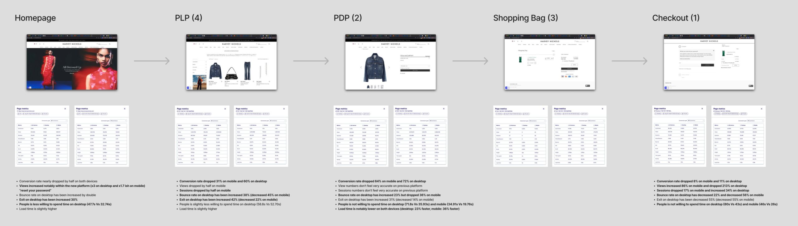
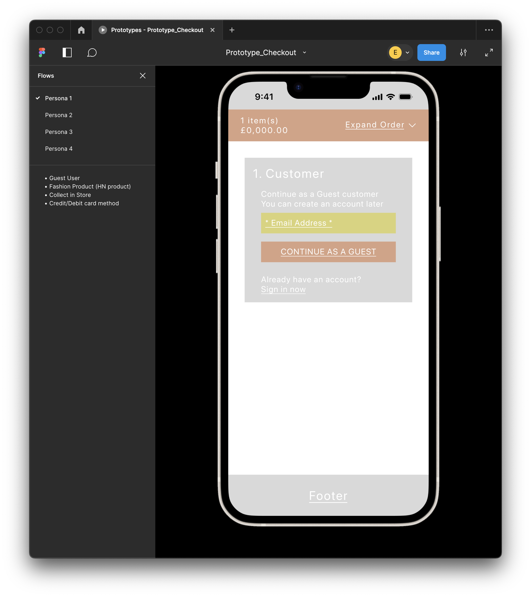
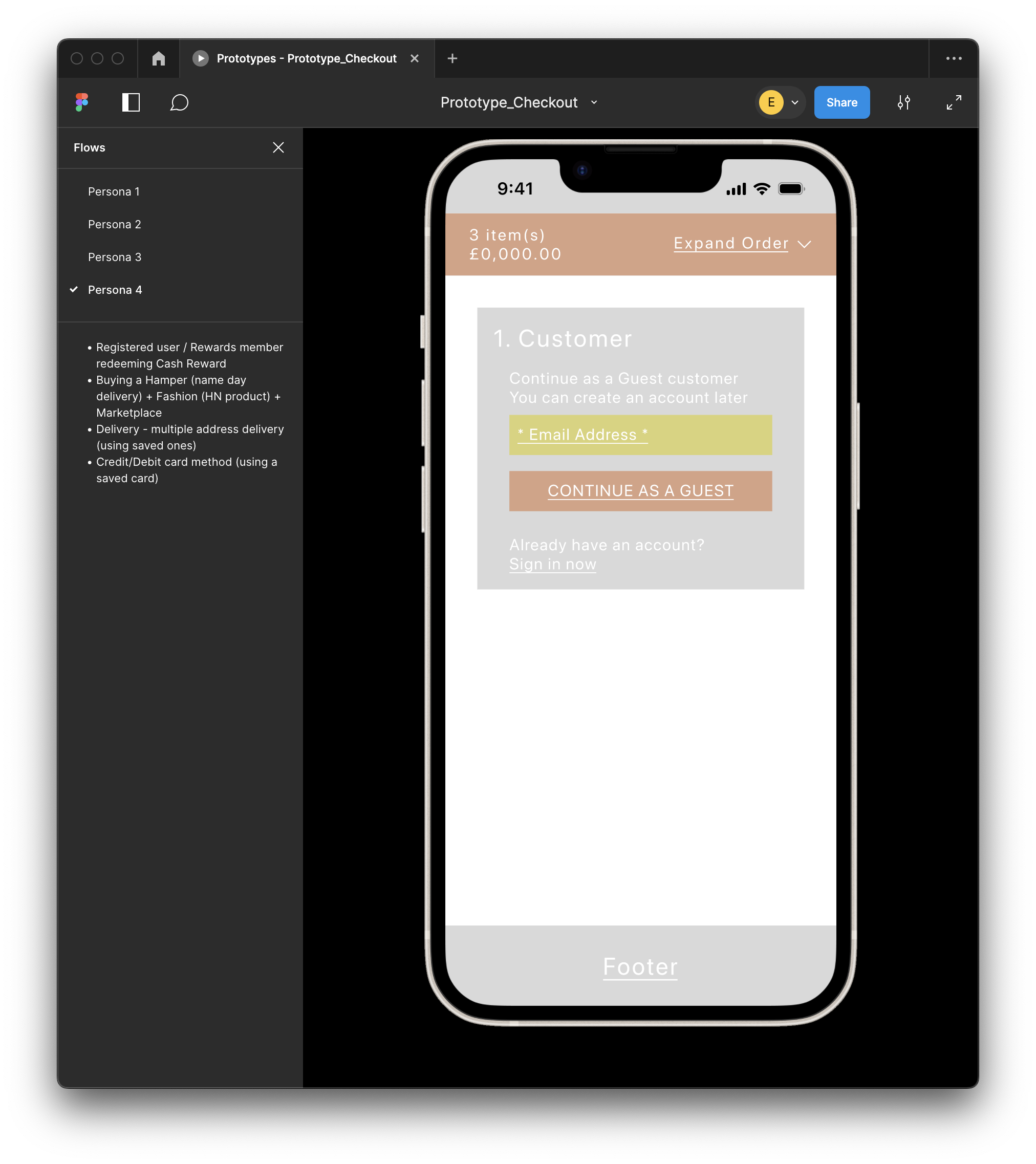
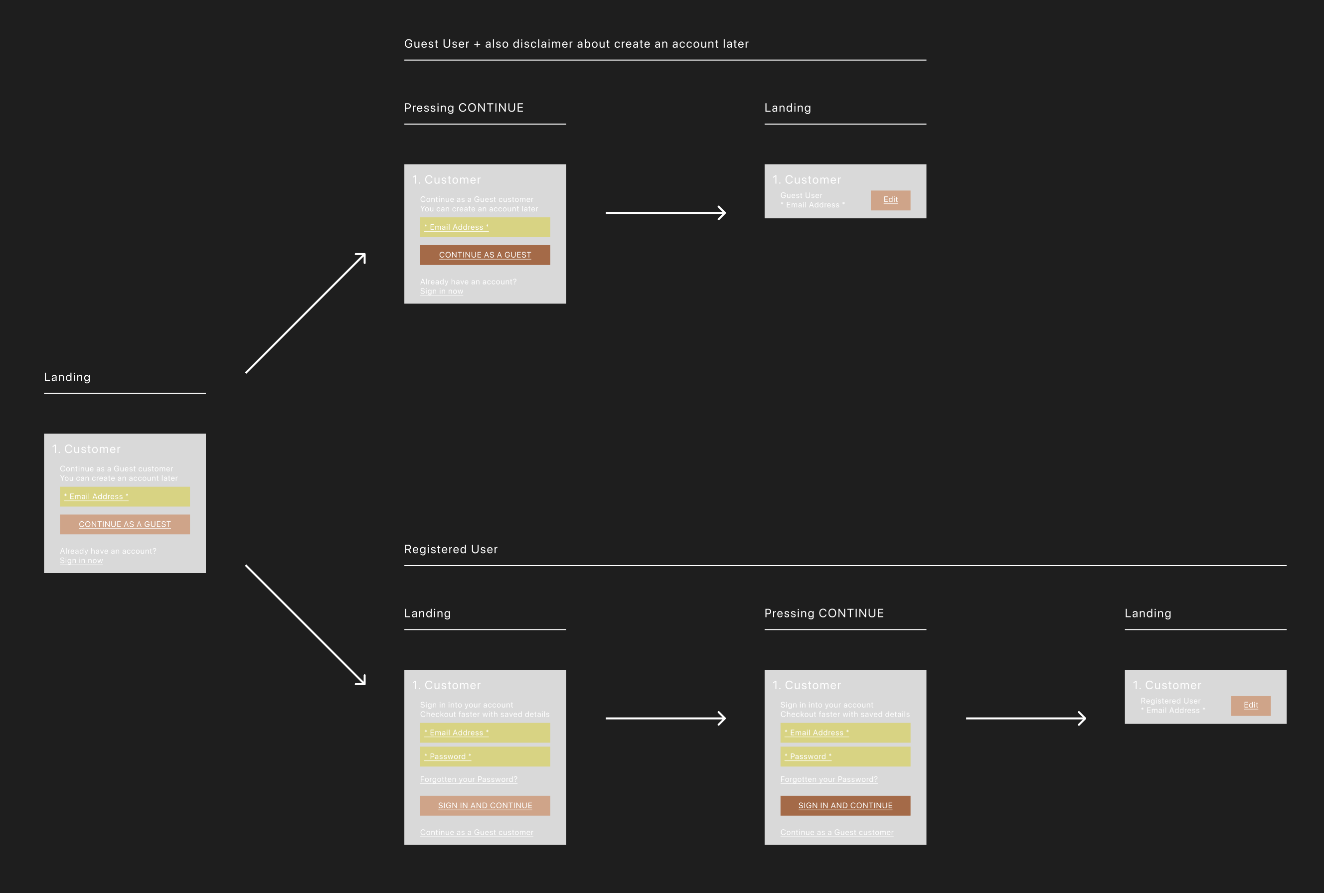
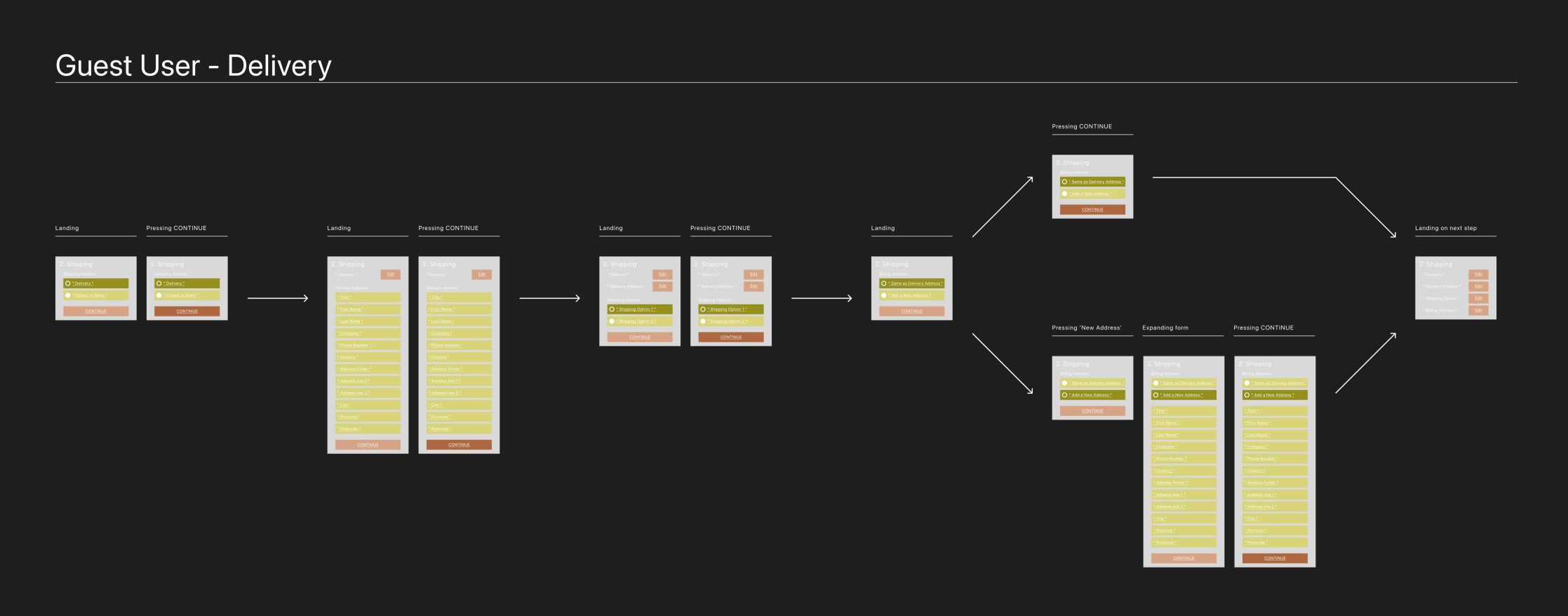
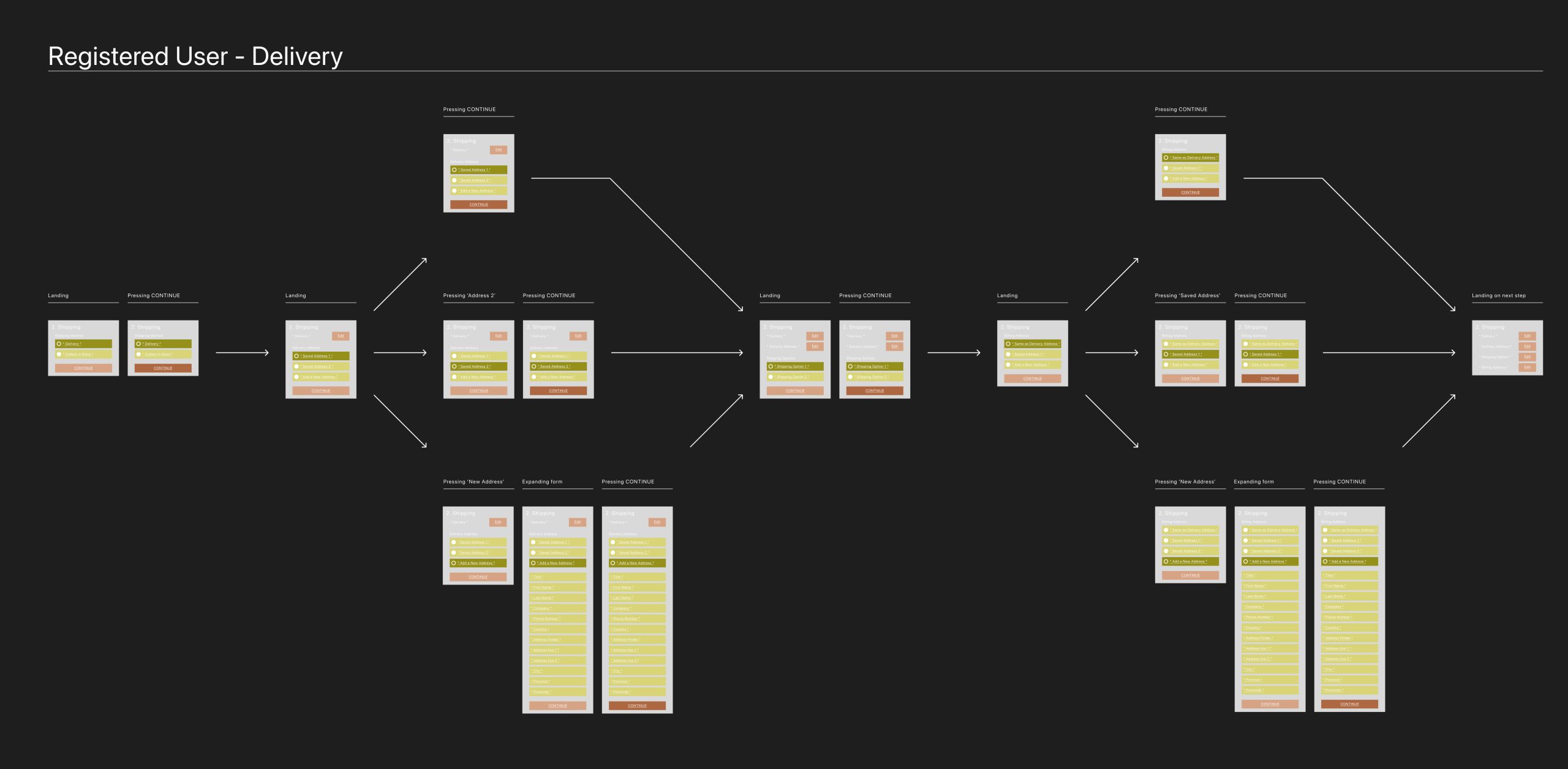
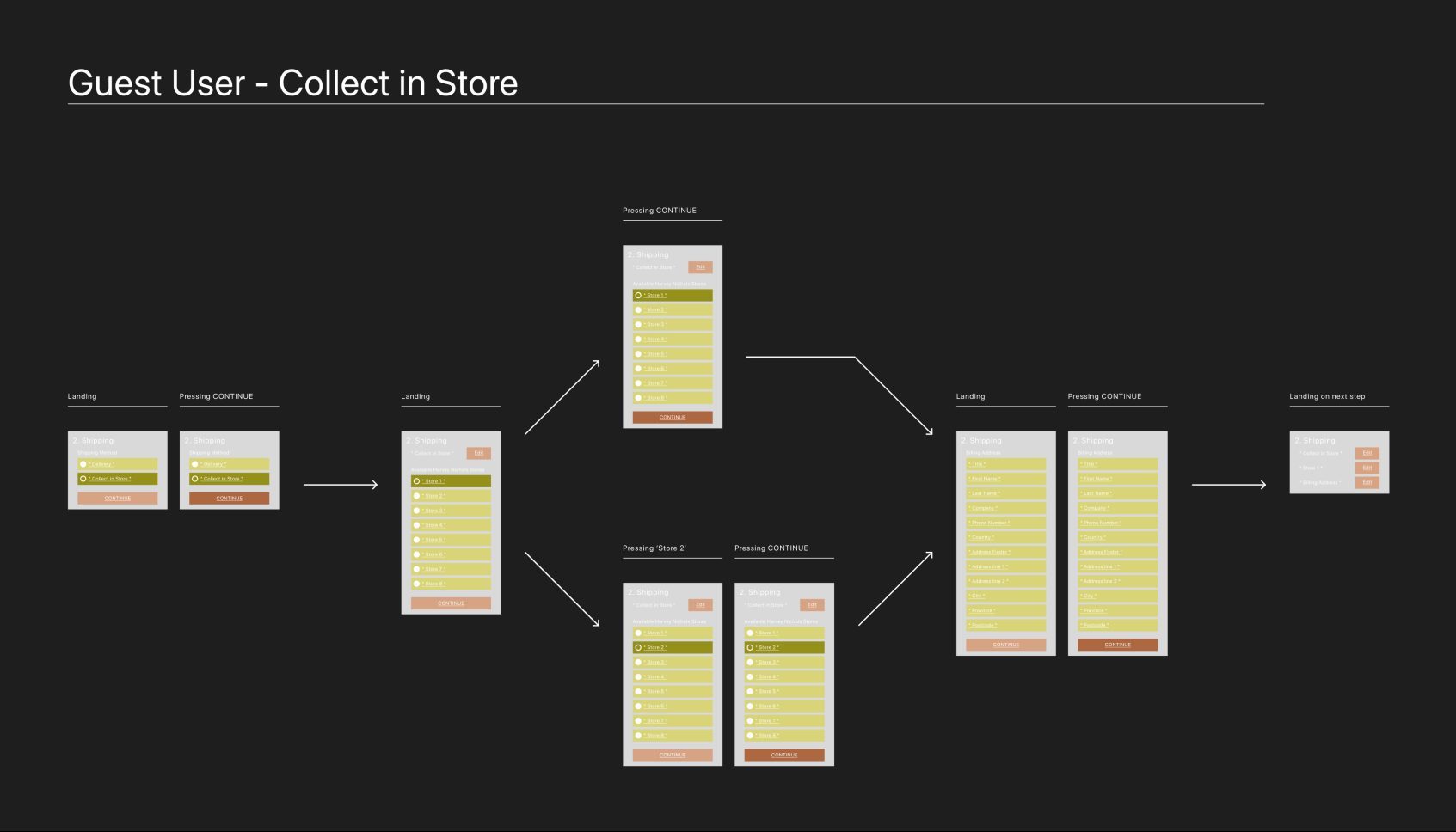
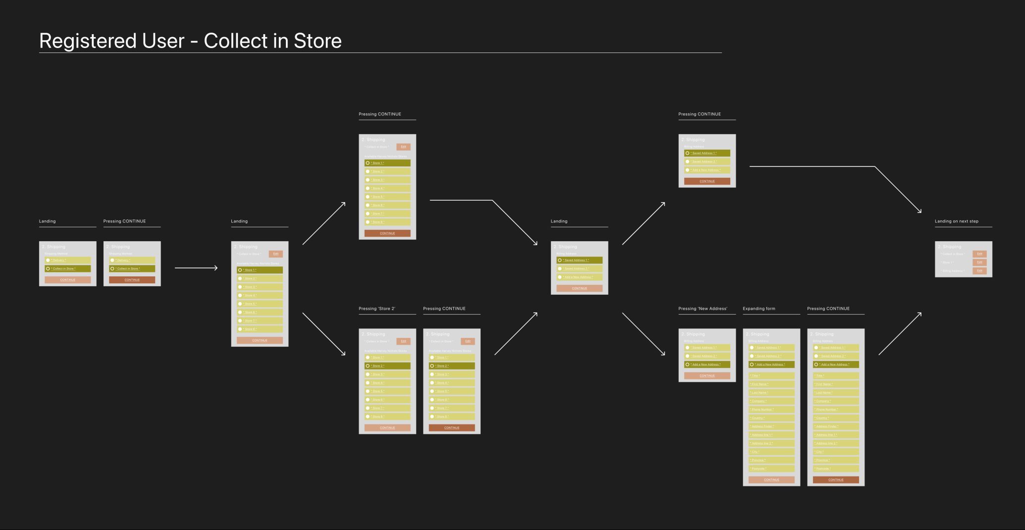
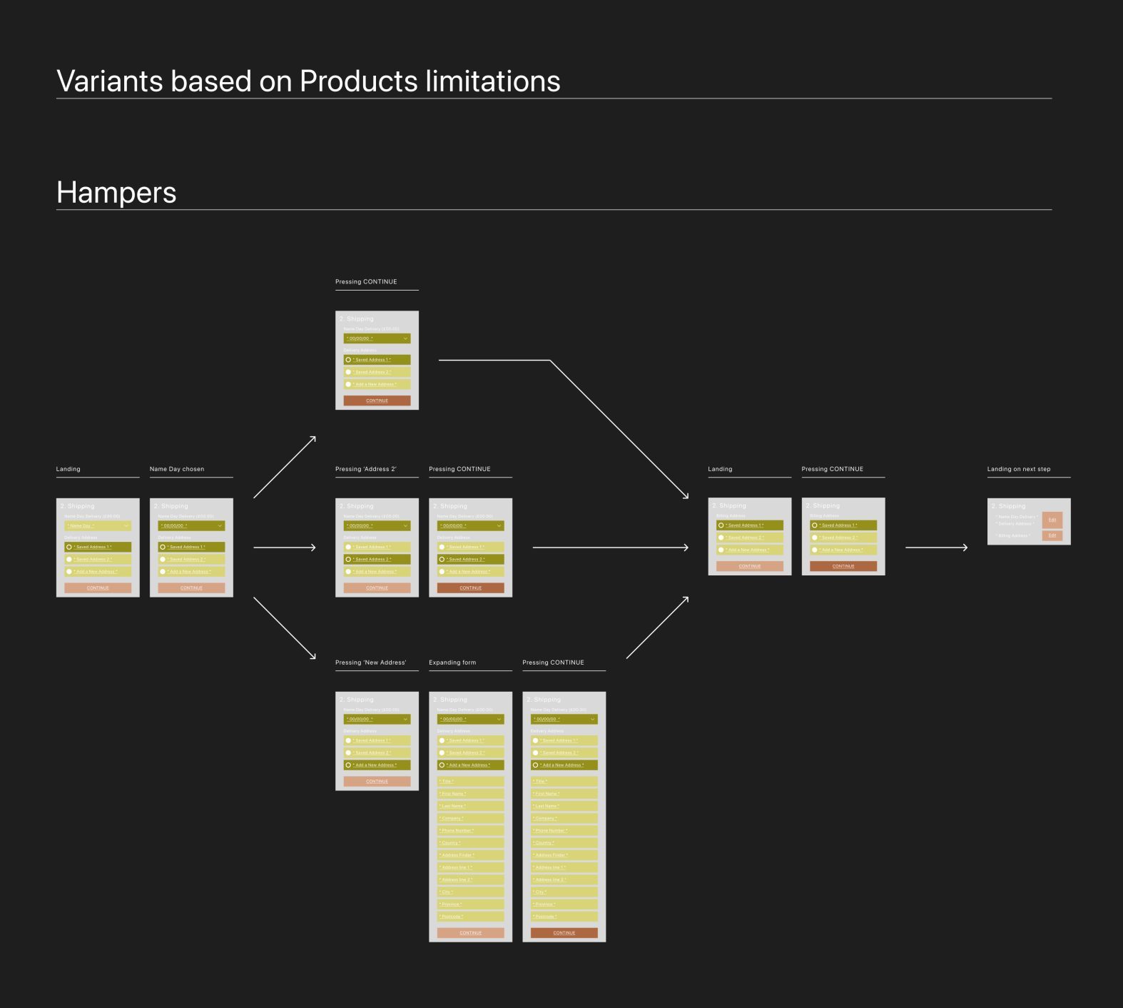
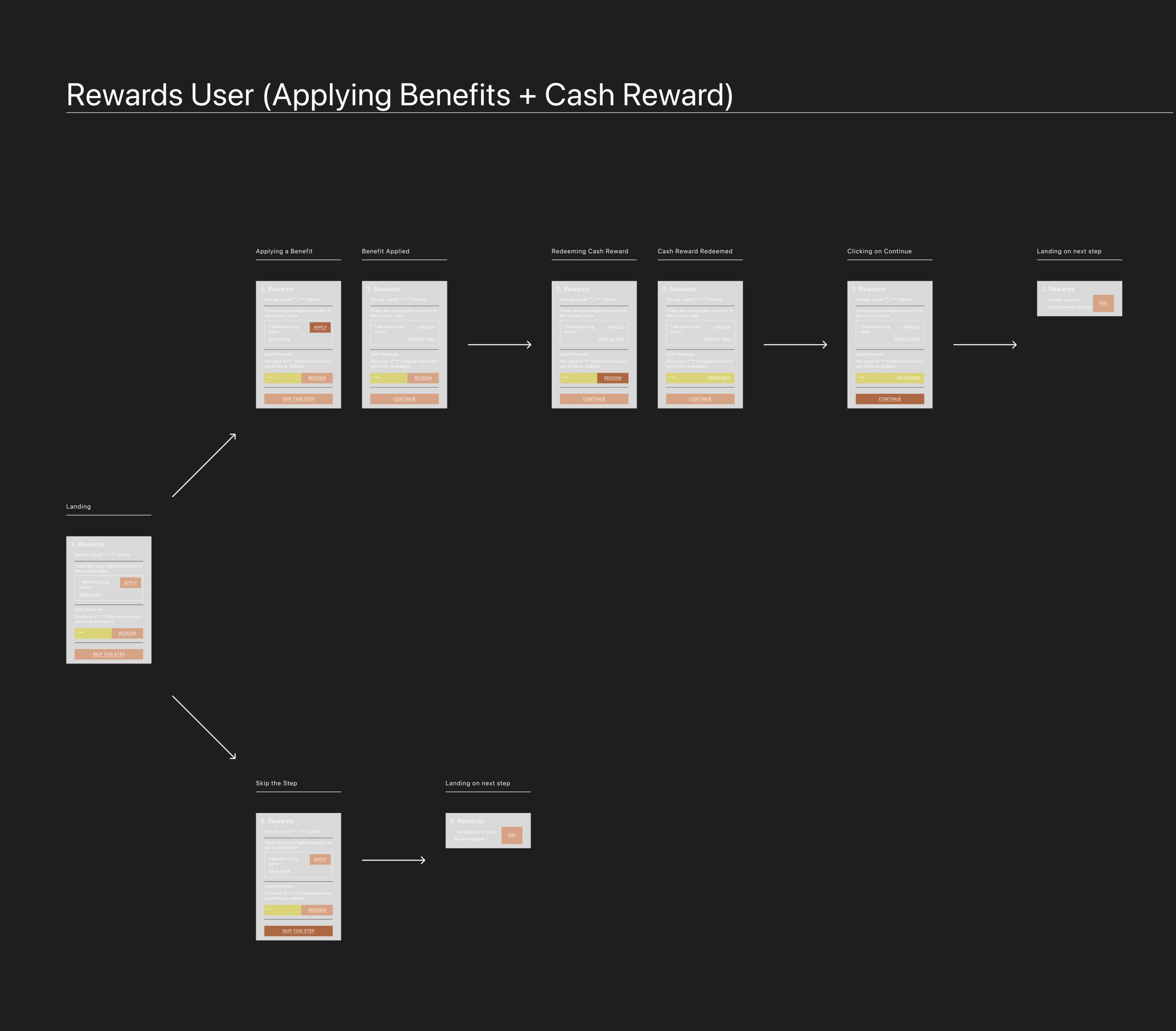
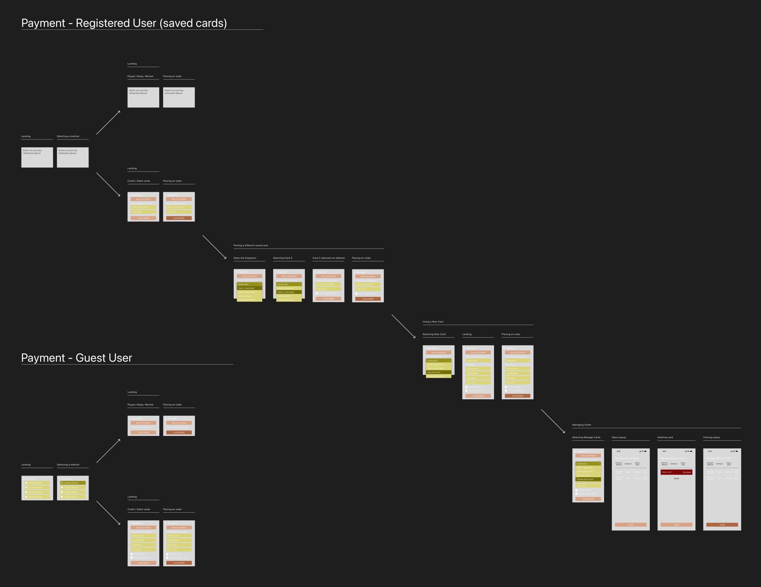
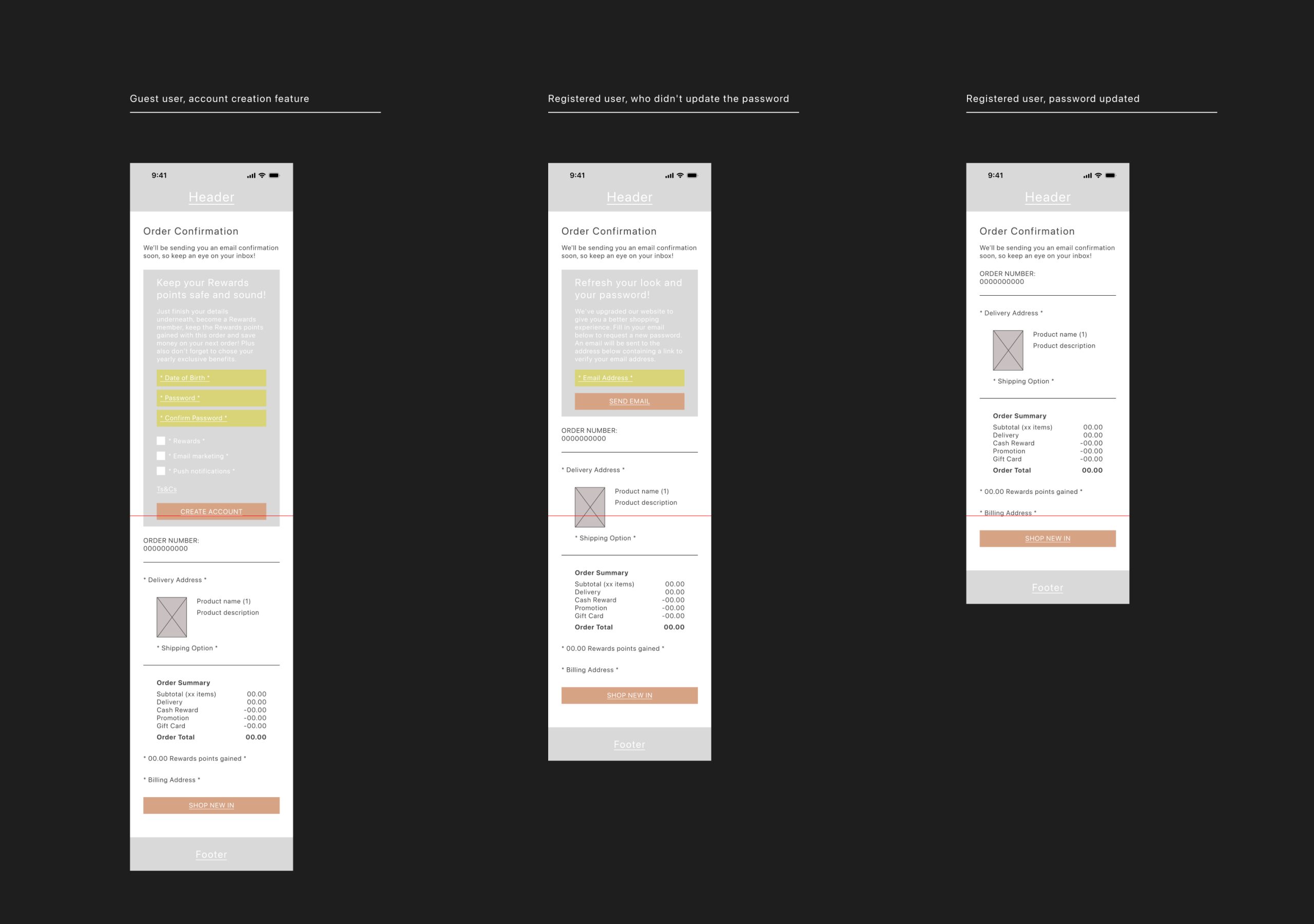
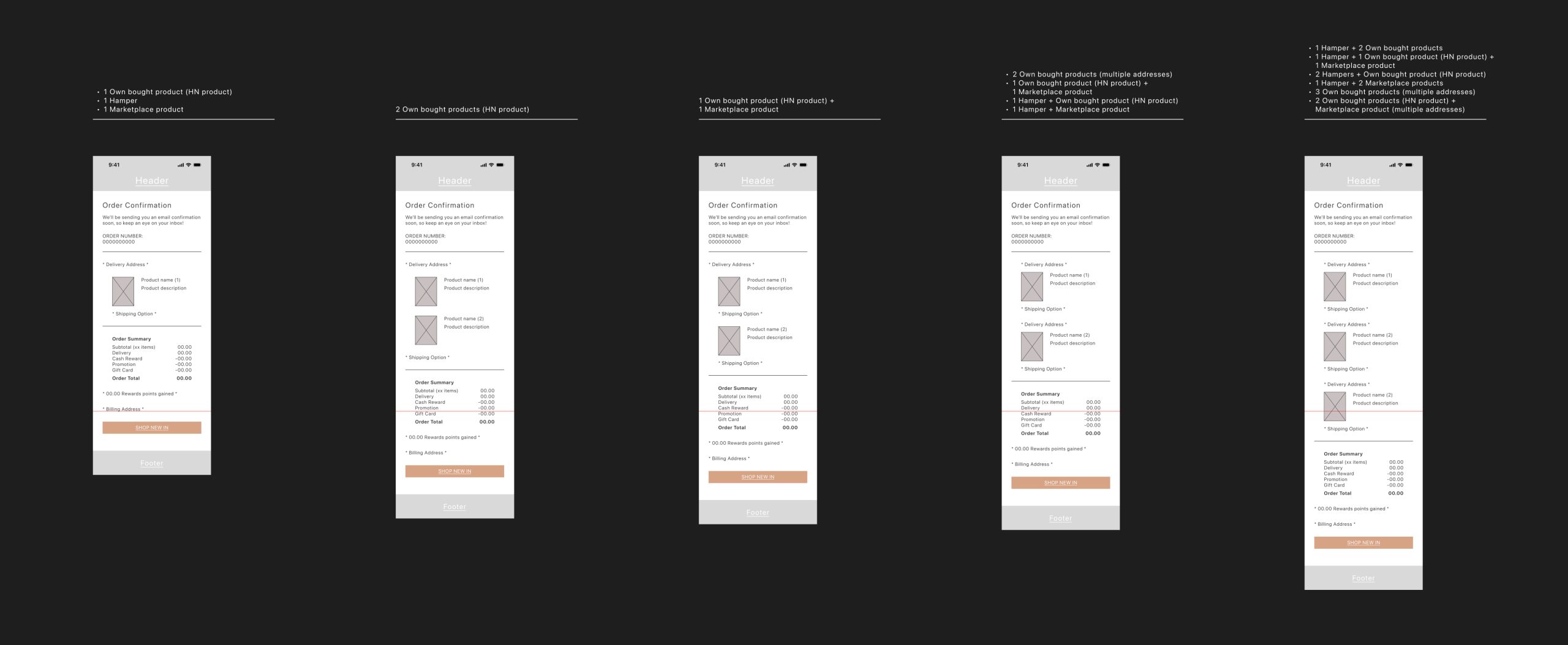
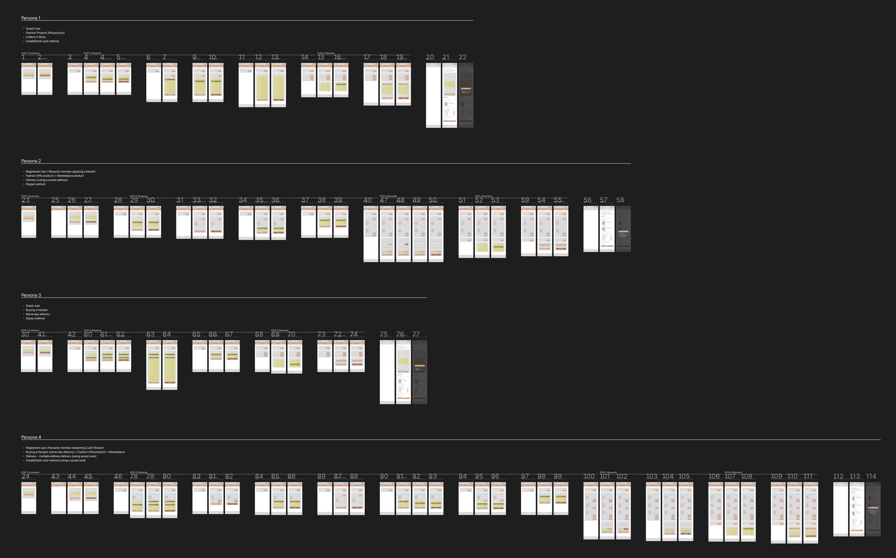
The Harvey Nichols checkout project was a comprehensive redesign of the checkout process for both the website and the native app. The goal was to enhance the user interface (UI) and user experience (UX) by streamlining navigation, reducing the steps required to complete a purchase, integrating modern payment methods such as Apple Pay and PayPal, and ensuring design consistency across platforms. The process aimed to create a seamless checkout experience, driven by qualitative and quantitative research, competitor analysis, and data-driven solutions to inform decisions and meet user needs.
Following the update, the improved checkout experience led to a significant increase in conversion rates, rising from 2.1% to 2.48%—an 18% uplift. By optimising usability and enhancing payment flexibility, the redesign not only improved customer satisfaction but also drove measurable business impact, reinforcing the value of thoughtful, user-centred design. UX design process followed is explained below.
Following the update, the improved checkout experience led to a significant increase in conversion rates, rising from 2.1% to 2.48%—an 18% uplift. By optimising usability and enhancing payment flexibility, the redesign not only improved customer satisfaction but also drove measurable business impact, reinforcing the value of thoughtful, user-centred design. UX design process followed is explained below.